
Red

Solotactix exists to make defensive training approachable, structured, and grounded in real life. The brand represents real-world safety, awareness, responsible ownership, and mentorship-driven instruction for everyday people—not theatrics, ego, or fear-based messaging.
Visually and verbally, Solotactix should feel calm, clear, and confident. We respect the seriousness of the subject while keeping the experience welcoming for beginners. Trust is built through clarity, consistency, and restraint—not noise.
The Solotactix voice is direct, disciplined, and clear. It carries trusted-mentor energy: relatable but controlled, never performative. We avoid fluff and stay grounded in real situations students actually face.
Characteristics: direct; disciplined; clear; trusted mentor energy; relatable but controlled; no fluff; grounded in real life.
Lead with platform-friendly language: training, safety, awareness, protection, responsible ownership, equipment. These terms frame what we do in a way that is accessible to a broad audience and appropriate for public channels.
Avoid leading with gun, weapon, or firearm. Those words may be used when necessary for accuracy, clarity, or legal context, but they should not be the primary frame for the brand story.
Use the wordmark as the default mark in most layouts. The badge is a secondary mark for compact contexts such as icons, avatars, and tight UI. The TM variant is available from the wordmark download options.
Red is the default color on light backgrounds. Use the white version on dark backgrounds and the black version when red is not appropriate. Gold (TM wordmark, PNG only) is for premium or special-use applications—choose With TM, then Gold, in the wordmark download options.
Red

Black

White
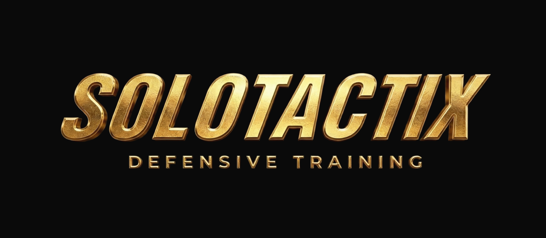
Gold
Red
Black
White
The Solotactix wordmark is the primary brand identifier. It should appear in marketing materials, the website, presentations, and most external-facing layouts unless space or context clearly calls for the badge alone.
The badge is the secondary mark. Use it where the full wordmark does not fit: app icons, profile images, favicons, small digital placements, and other compact surfaces. Do not treat the badge as interchangeable with the wordmark in hero or headline contexts.
The ™ designation is for official external-facing brand materials where trademark notice is appropriate. For day-to-day content—social posts, apparel, video, and informal collateral—prefer the non-™ mark. Do not overuse ™; when in doubt, use the standard wordmark.
The descriptor “Defensive Training” may accompany the wordmark in primary or introductory contexts where extra clarity helps. At smaller sizes or when a cleaner lockup is required, drop the descriptor and use the wordmark alone.
The core palette stays tight: Solo Red for logos and print, Digital Red for the website and digital UI (buttons, links, accents), and black and white for structure and contrast. A gold TM wordmark is available in the asset pack for rare premium use only—it is not listed as a core digital swatch.
Do not swap Solo Red and Digital Red arbitrarily—logos and lockups follow Solo Red; screens and interactive states follow Digital Red unless a specific asset specifies otherwise.
Hex #E90017
RGB 233, 0, 23
CMYK 0, 100, 90, 9
Solo Red
Hex #D71327
RGB 215, 19, 39
CMYK 0, 91, 82, 16
Digital Red
Hex #000000
RGB 0, 0, 0
CMYK 0, 0, 0, 100
Black
Hex #FFFFFF
RGB 255, 255, 255
CMYK 0, 0, 0, 0
White
Open Sans is the primary typeface for body copy, UI, and most marketing collateral. Use weight and size for hierarchy—not decorative styling.
Bangers is reserved for short, high-impact social headlines. Do not use it for body copy, long captions, or formal or legal content.
Open Sans · body & general use
The quick brown fox jumps over the lazy dog. 0123456789
Open Sans on Google Fonts →Do not apply effects to the logo: no shadows, outlines, glows, gradients, or filters. Do not recolor outside approved red, black, and white (and approved gold for special use only).
Do not distort, rotate, tilt, warp, or stretch the mark. Do not place the wordmark and badge so close that they read as a single cluttered unit—maintain intentional separation when both appear.
Do not place logos on low-contrast or visually busy backgrounds where the mark cannot be read at a glance.
The diagram below summarizes correct and incorrect treatments—effects, unapproved color, distortion, crowding, and contrast—for quick reviews.
Maintain clear space around the wordmark equal to at least the height of the “O” in Solotactix on all sides. Apply the same discipline to the badge: the mark should never feel cramped against neighboring elements or the edge of the canvas.
Reference diagrams below illustrate minimum clear space for the wordmark and the badge.